
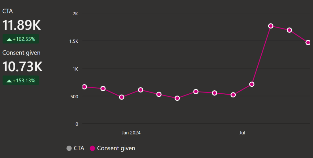
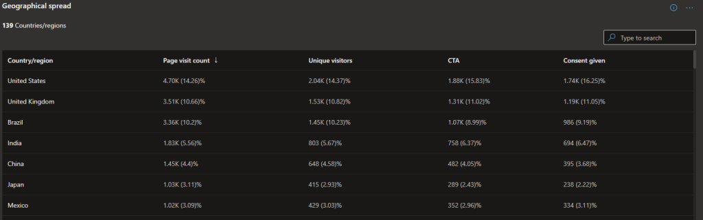
Pro²Future sucessfully published two custom Power BI visuals on the Microsoft AppSource, originally developed as part of a COMET-Project. Over the past year, these visualizations have been downloaded more than 10.000 times, with the majority of downloads from the United States and the United Kingdom, and 50 downloads from Austria.
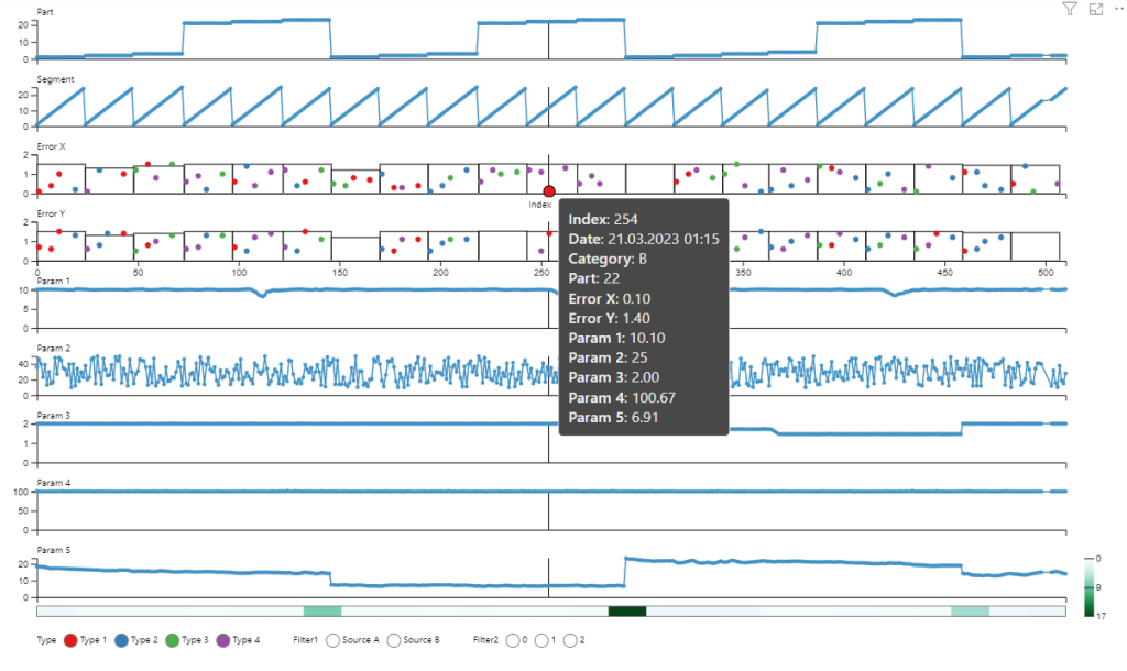
Multiple Stacked Charts released in March 2023, is a powerful tool for comparing numerical data along a common date or numerical X-axis. It addresses the common challenges of occlusion and visual clutter that occur in other types of visualizations by displaying each parameter in its own plot. This makes it much easier to compare multiple parameters with varying characteristics or ranges.
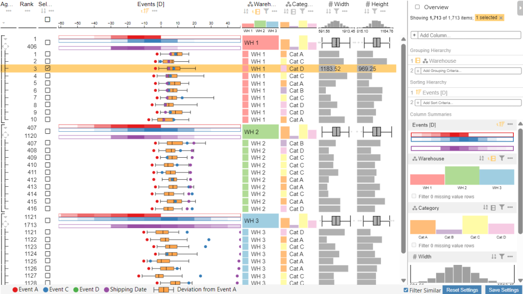
The Event Table Viewer published in July 2024 , is based on LineUp.js and designed for analyzing event data alongside categorical and numerical data within a tabular layout. It allows multiple event types to be displayed per row on a shared time scale. Users can align events by a specific event type and sort them accordingly. A boxplot feature shows the event distribution, enabling comparison of similar data. The table also supports grouping, sorting, and filtering by multiple columns, while visualization types for individual cells, group summaries, and column summaries can be fully customized for each column.
These visualizations are designed to empower users with more intuitive and flexible ways to visualize and analyze their data. As they continue to gain traction in the Power BI community, we look forward to seeing how they will be applied to solve real-world challenges in production systems and beyond.